Overview
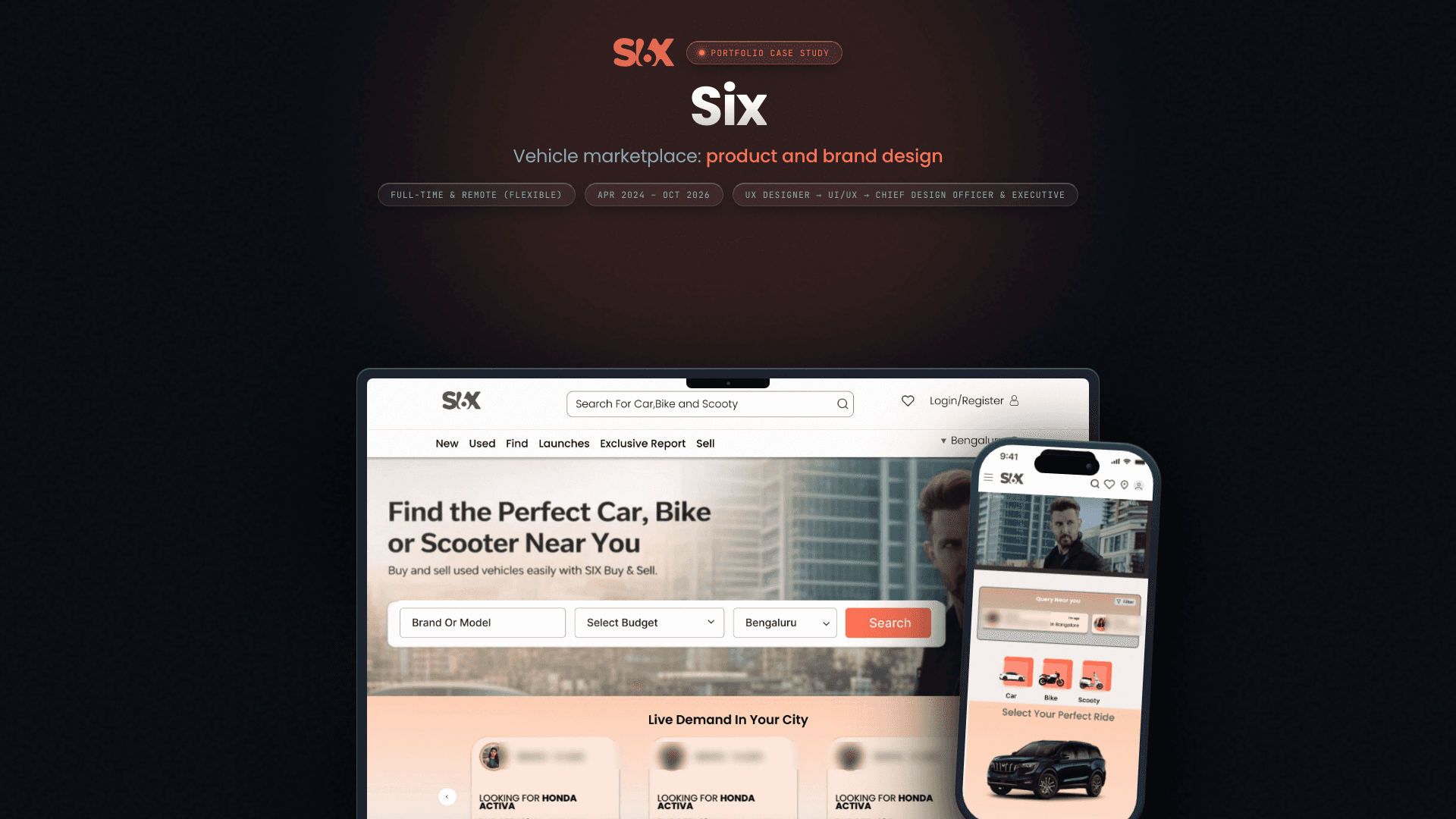
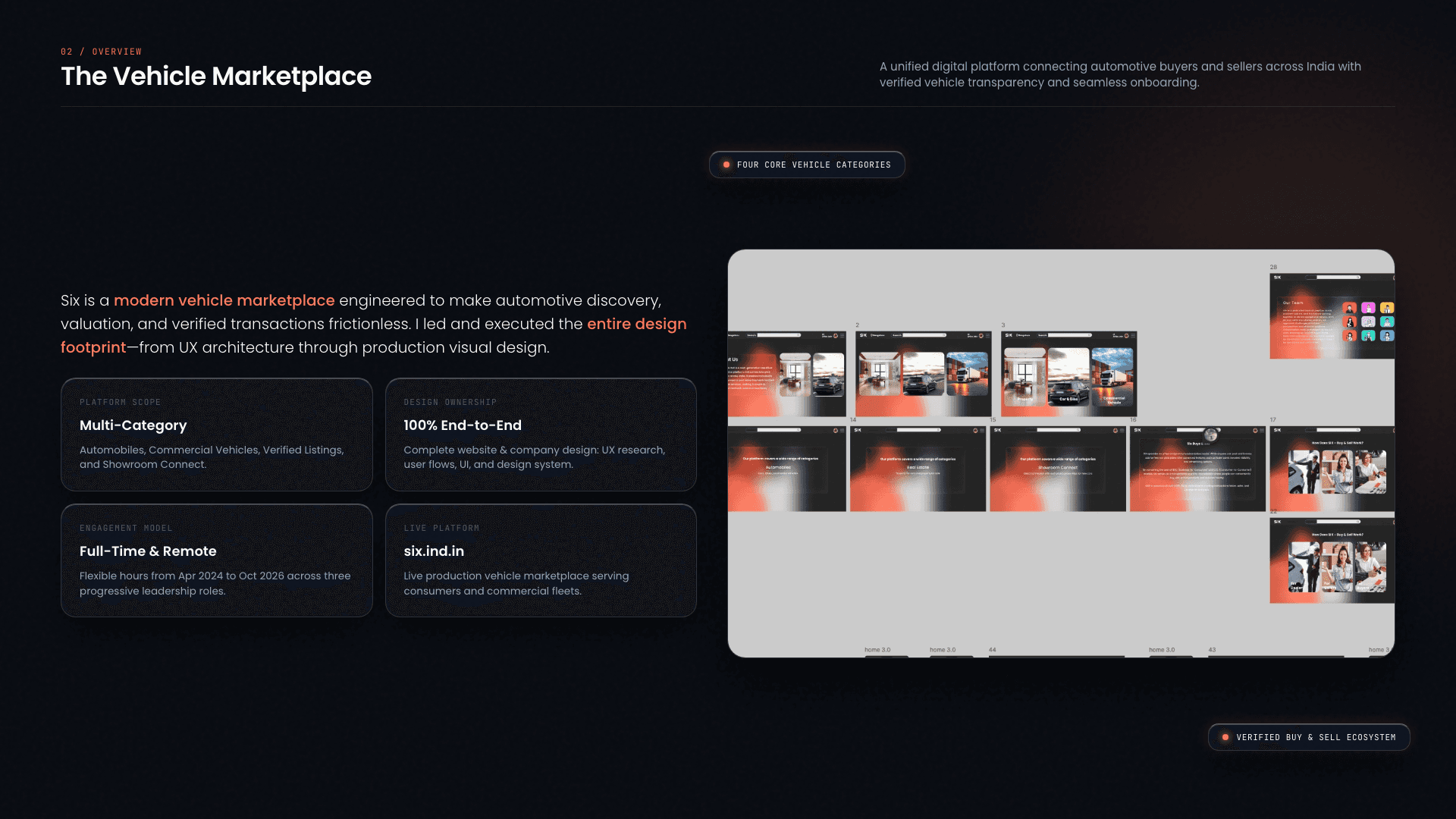
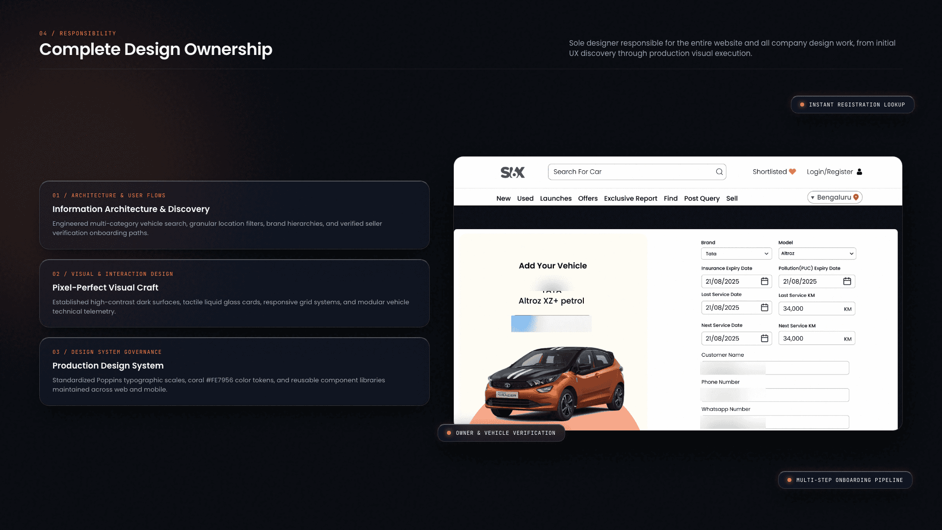
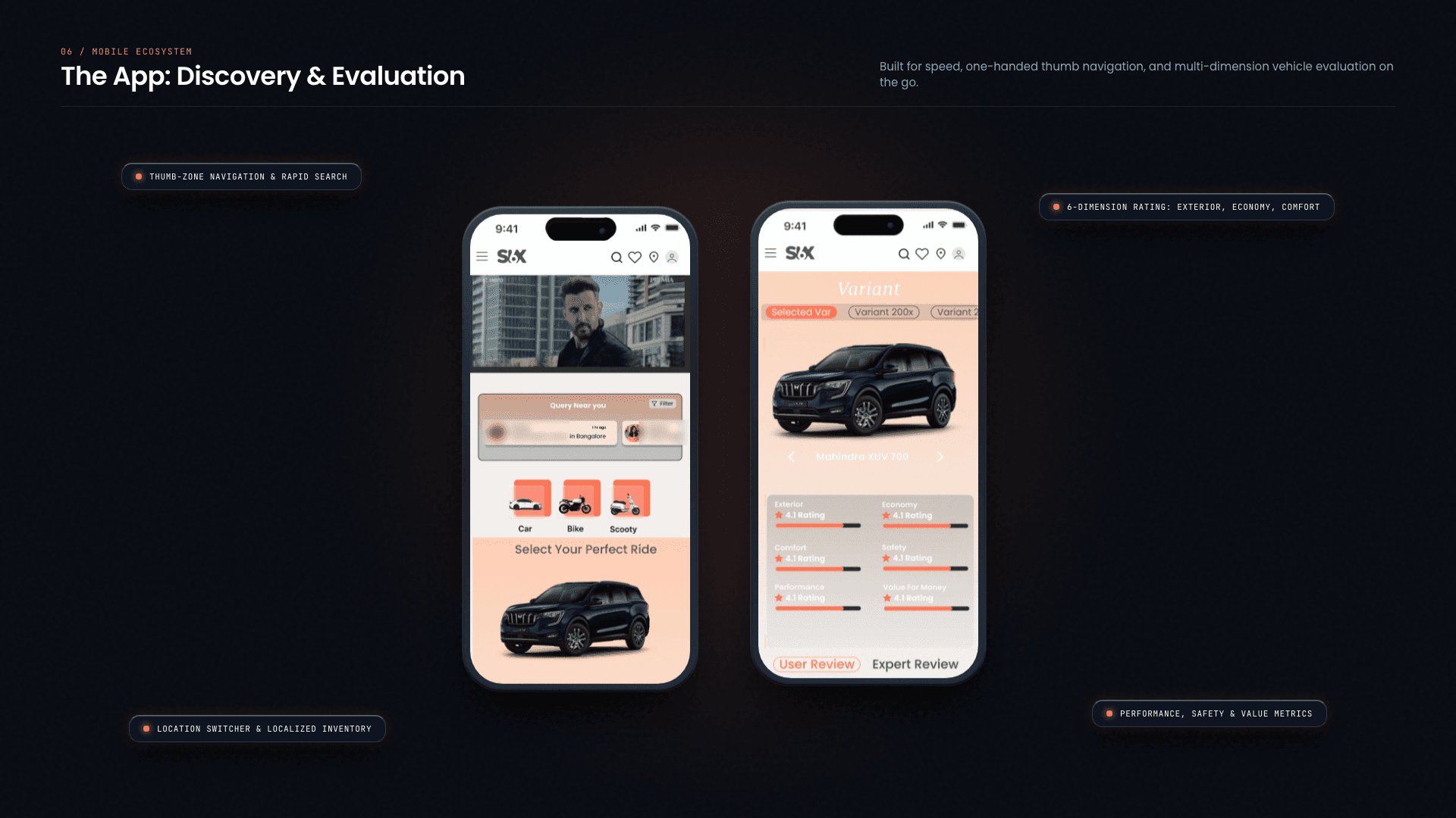
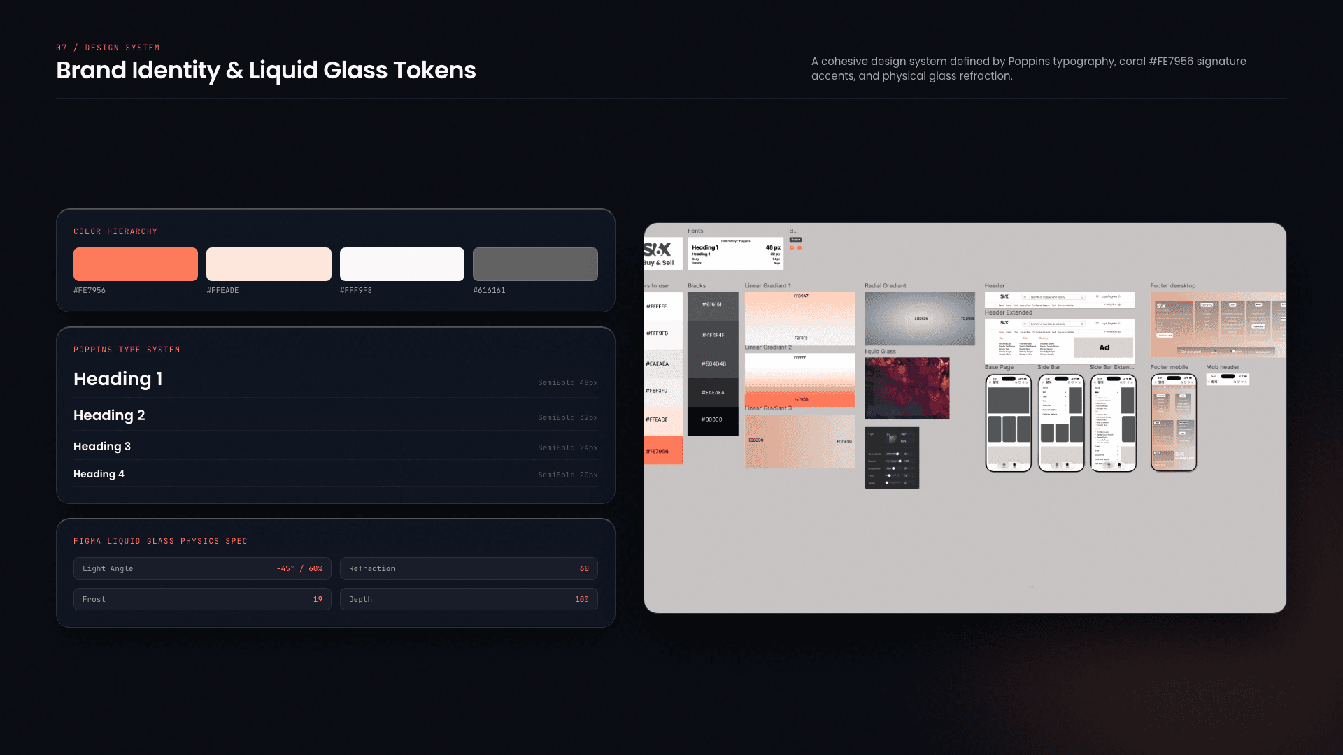
Six is a buy-and-sell product. I designed the entire website and the company’s design work, covering the experience from UX structure through visual design.
My role
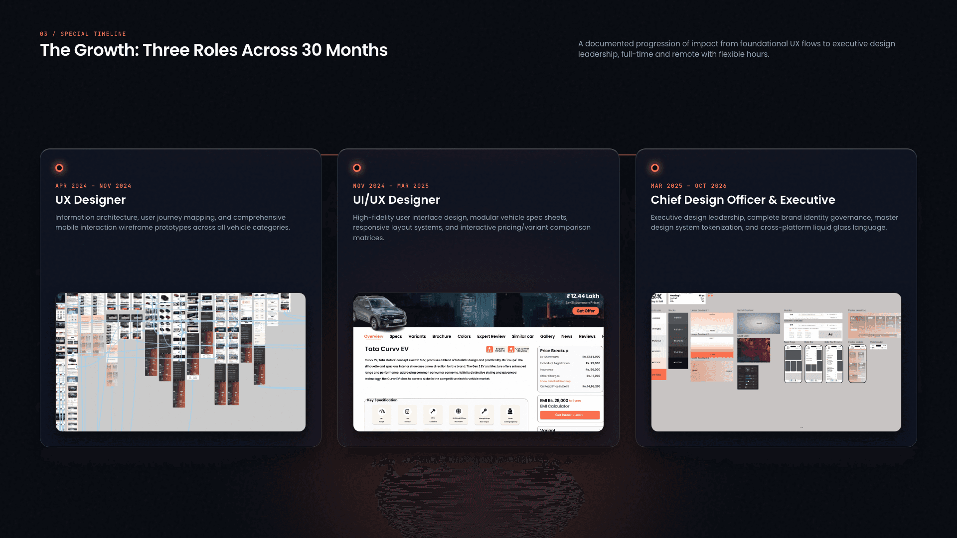
I joined Six as a User Experience Designer, moved into UI and experience design, and later became Chief Design Officer and Executive.
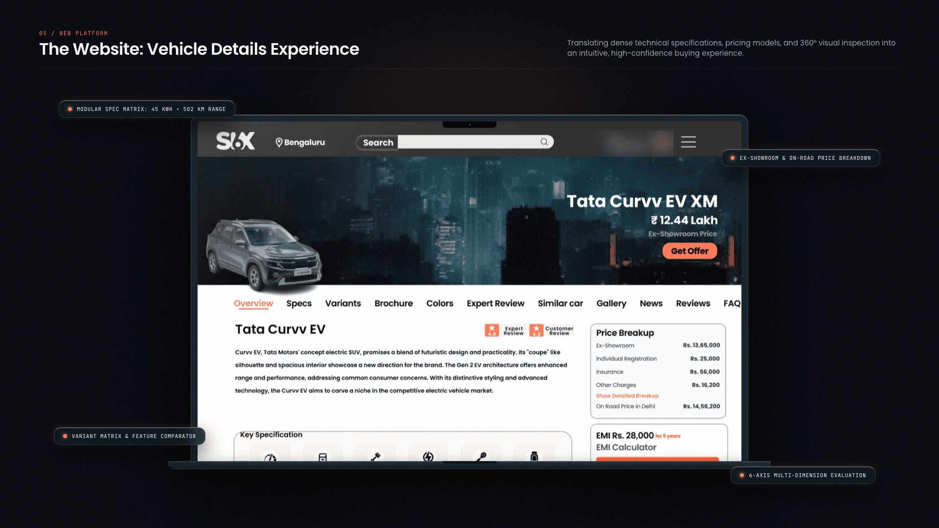
Across those roles, I owned the website’s UX and visual design. The vehicle details page shown here is one part of that larger system.
Problem
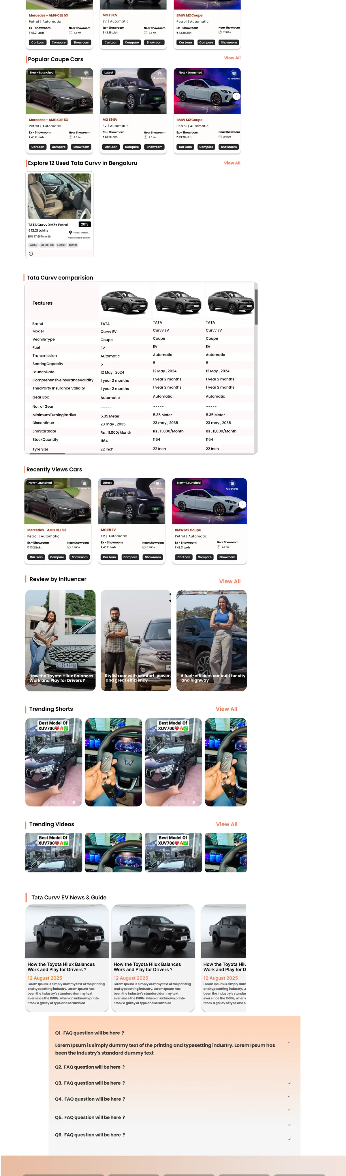
The vehicle details page had to hold a large amount of buying information without losing the path to action. The supplied design brings together price, specifications, variants, local services, editorial content, reviews, comparisons and related inventory on one page.
Process
Start with the buying decision
I put the vehicle, price and primary offer action at the top, followed by an overview, key specifications and variants. This gives the first screen a clear order before the page expands into detail.
Separate dense information into sections
I divided the long page into named sections for specifications, colors, expert content, reviews, news and frequently asked questions. The repeated structure keeps a dense catalogue readable.
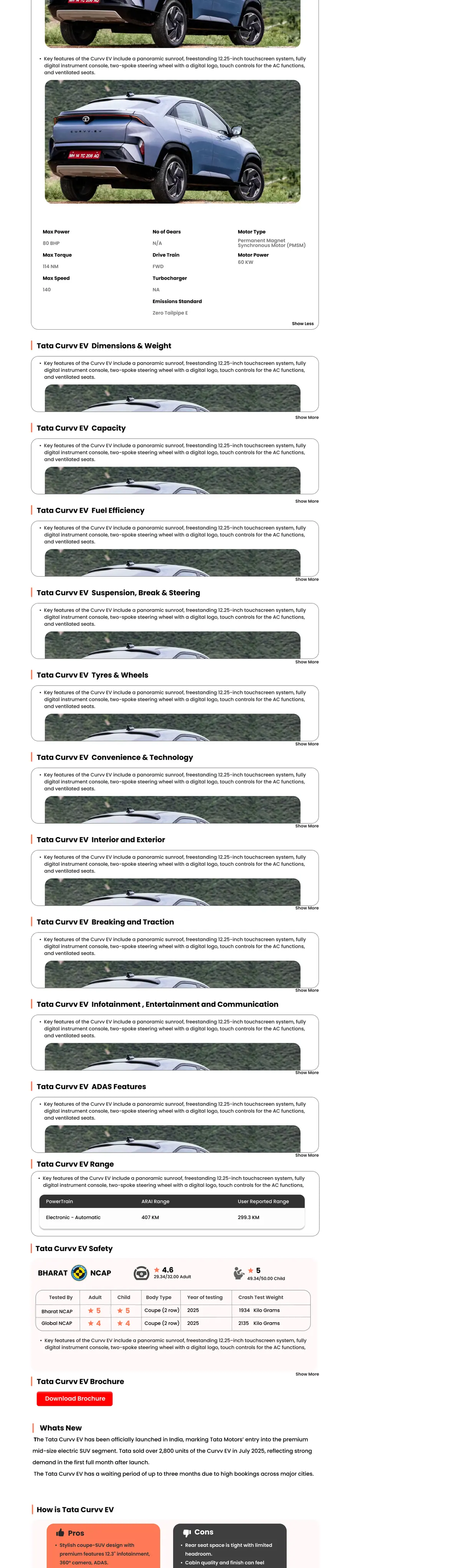
Connect research to inventory
I carried the page from product research into reviews, recommendations, comparisons and used inventory so users could continue evaluating options without leaving the product context.
Solution
Evidence for evaluation
The lower sections combine product facts with expert content, pros and cons, safety information and user reviews. Each content type has its own visual treatment while staying inside the same page system.
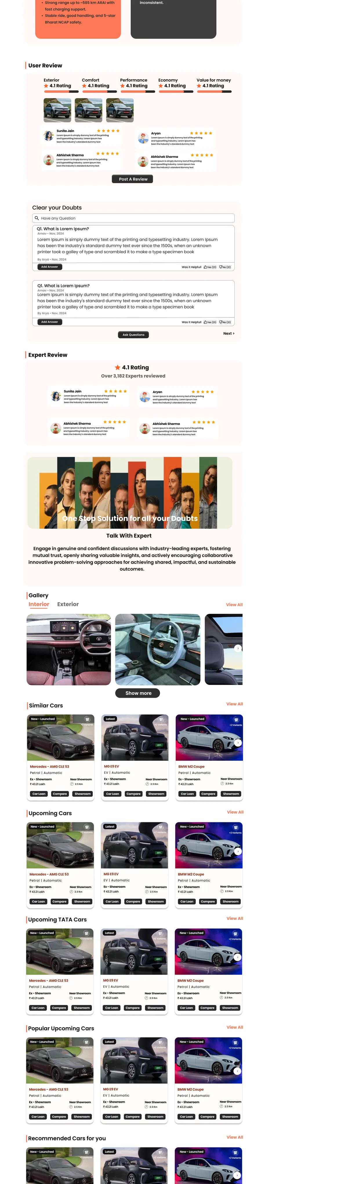
A route to the next option
Recommendations, comparisons and used listings turn the end of the details page into a continuation of the marketplace rather than a dead end.